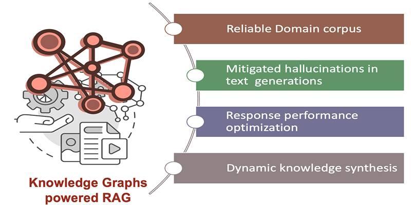
Network visualization sounds technical, but the heart of it is simple. You take things that relate to each other and draw lines between them. The things are called nodes. The lines are edges. Stronger relationships get thicker lines. With that small toolkit, you can turn a long list of results into a picture that our eyes grasp in a heartbeat.
For bodybuilding history, a neat way to build such a picture is to use the Top 3 finishers at Mr Olympia across many years. Each medal stand becomes a tiny social scene. Everyone who shared that podium gets linked. Stack those scenes across decades and a hidden map of eras, rivalries, and handoffs between champions takes shape.
From Podiums To Nodes
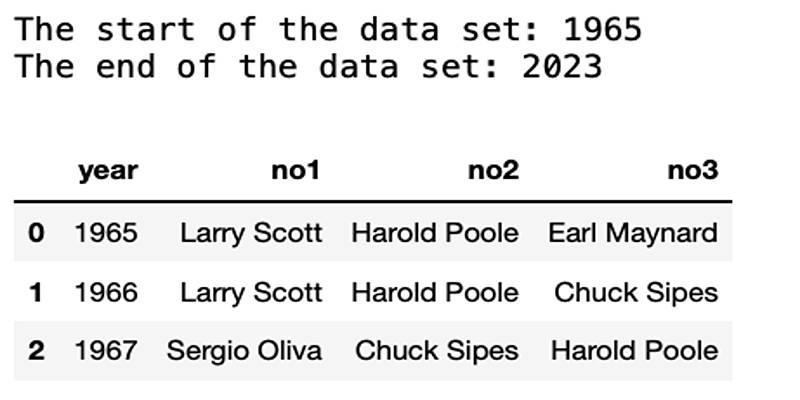
The data sits in plain sight. Each year lists first, second, and third. Ties happen now and then, which means you sometimes split one podium spot into two names, but the rule stays steady. Every athlete in the top three becomes a node. If two athletes stood on the same podium in a given year, you draw an edge between them. That edge gets a weight of one for that year. When they meet again on a future podium, the same edge gets heavier. No fancy math is needed at this stage.
This approach keeps the focus on context, not just wins. It respects the sport’s rhythm. Greats rise, meet other greats, trade blows for a few seasons, then pass the torch. You might remember isolated wins, but a network brings back the seasons where paths crossed, sometimes four or five times in a row, shaping an era.
Edges, Weights, And Rivalries
Edges carry stories. A thick line between two names hints at a rivalry you can feel in old photos and grainy clips. Think of the years when a champion kept meeting the same few challengers. The graph turns those memories into a pattern you can point to. You can also watch a newcomer step into the cluster that surrounds the reigning star. At first, their links are thin. After two or three shared podiums, the newcomers’ ties thicken and the layout pulls them toward the centre of action.
This can surface figures who never won but kept showing up. A long list of seconds and thirds might fade in a simple table. In a graph, that consistency glows. The athlete becomes a hub that touched many finals, shaping the era even without the crown.
Eras That Pop From The Graph
When you run a layout that spreads nodes based on their links, the sport’s timeline appears as islands that gently overlap. The golden age forms one cluster, where names like Arnold Schwarzenegger and Frank Zane sit close to old partners in victory. You can spot Sergio Oliva and Franco Columbu nearby, tied by shared stages and repeated showdowns. The cluster feels tight, reflecting a scene where the same circle kept meeting under bright lights.
From there, the map stretches toward the 1980s and 1990s. Lee Haney anchors a new centre. Around him, you see frequent finalists who rose with him or chased him. Move forward, and the shape-shifts again as Dorian Yates redraws the middle of the network. The links grow dense because he kept meeting the same elite cast across several seasons. Keep drifting, and you reach the heavy modern core formed by Ronnie Coleman, Jay Cutler, and Phil Heath. The edges between them and their regular opponents are bold because the same faces kept filling medal spots, sometimes swapping places but rarely leaving the spotlight for long.
What makes this powerful is the quiet evidence. No hype. Just connections. The cluster around each champion tells you how dominant and how crowded their scene was, and for how long. Short arcs form small, crisp shapes. Long arcs form sprawling webs, pulling many names together.
How Network Metrics Reveal Hidden Legends?
You do not need a long stats lesson to get value from a few common measures. Degree is the count of links each athlete has. A high degree means a lot of shared podiums with many people, usually spread across several seasons. Weighted degree adds up the strength of each link. That favors repeat matchups, which is handy if two athletes met in finals again and again.
Betweenness centrality spots connectors who sit on the shortest paths between groups. In simple words, these are the athletes who bridged eras. They might have started against the tail of one generation, then matured into battles with the next, tying clusters into a single storyline.
These numbers are guideposts, not hard verdicts. They help you check whether the picture matches your memory. If a name feels pivotal, you will often see a high degree or high betweenness. If a champion’s reign was lonely, with few steady rivals, the graph can look star-like, with many thin spokes and fewer thick lines.
How Tools Shape The Picture?

You can build the network with a spreadsheet and a bit of scripting, then view it in software like Gephi. The key is clean names and careful handling of ties. Once you export nodes and edges, the layout choice matters. Force-directed layouts spread the graph so that linked nodes draw closer, while unrelated nodes drift apart.
Try a layout, step back, and ask if the image fits the story you know. If not, adjust labels, scale edge thickness by weight, and color by community detection. Community colors often line up with eras because the same set of athletes kept sharing finals during a window of time. When the coloring cuts across years in a strange way, you may have found a bridge athlete who ties two periods together.
Conclusion
Bodybuilding history carries a lot of names, dates, and heated debates. A shared podium network trims that weight and keeps the truth that matters most. Who met whom, how often, and when the tide turned.
With nodes as athletes and edges as co-appearances, the graph marks the golden age, the Haney years, the Yates shift, and the hard modern era defined by Coleman, Cutler, and Heath. A few simple metrics help you spot hubs, rivals, and bridges between clusters. Clean data and a steady hand with layout choices do the rest.